Free resources
I do a lot of presentations, both inside and outside of the university. When presenting, I often use photographs I have taken or illustrations I create when writing papers as part of preparing for a lecture. I quite often get asked if people can use my material. I always reply, "Yes, of course, you can". This site is a place to collect and share the material I use most.
I appreciate attribution in some form, i.e., that you tell where you got the material from ("Per-Olof Hedvall"), but it is not mandatory.
📸 Photos
I have taken all the photos on this site. Please feel free to use them as you like.
🖍 Illustrations
Some of my most used and asked-for illustrations are available on this page, together with some thoughts behind them and how I use them in my teaching and lecturing.
N.B. The descriptions of the different illustrations below are very brief. Please refer to the papers I list for in-depth reasoning and further lines of thought.
All vs most vs some vs none – have we built our society on a too narrow base?
Below is an illustration that I frequently use in my presentations. It is based on a bell curve over the population, where most individuals are in the centre while some individuals are on the edges, excluded/marginalised. This way of thinking is the foundation for how accessibility and usability are conceptualised in standards and guidelines.
I use this illustration to highlight, for instance, that while most people are at the centre, this is not where we can learn the most about what flexibility is needed to acknowledge and support human diversity. At the outer edges, among "extreme users", "edge cases", "fringe cases", etc., that's where the people that can provide knowledge regarding what they struggle with and what support them can be found. That's also where the current non-users are. In the documentary "Objectified", Dan Formosa put says, "If we understand what the extremes are, the middle will take care of itself." More information about the documentary is on Gary Hustwit's website. You can watch it for free over at DocumentaryHeaven.

Hedvall, P.-O., Price, M., Keller, J., & Ericsson, S. (2022). Towards 3rd Generation Universal Design: Exploring Nonclusive Design. UD2022, Italy.
Collingridge dilemma
I sometimes relate to "Collingridge's dilemma" in my talks. He said:
"When change is easy, the need for it cannot be foreseen; When the need for change is apparent, change has become expensive, difficult, and time-consuming." – David Collingridge

For someone working with access and use, like me, it is easy to recognise a similar dilemma: accessibility, usability and universal design need to be part of the design process from the very start when the least is known about the end results, and the potential for access and use is at its highest.
Genus, A., & Stirling, A. (2018). Collingridge and the dilemma of control: Towards responsible and accountable innovation. Research Policy, 47(1), 61–69. https://doi.org/10.1016/j.respol.2017.09.012
Hedvall, P.-O., Ståhl, A., & Iwarsson, S. (2022). Tillgänglighet, användbarhet och universell utformning. In V. Denvall & S. Iwarsson (Red.), Participation (p. 151–181).
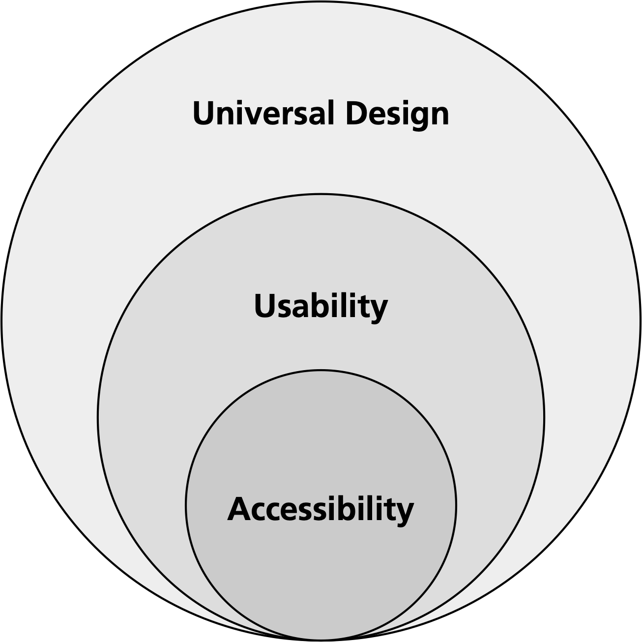
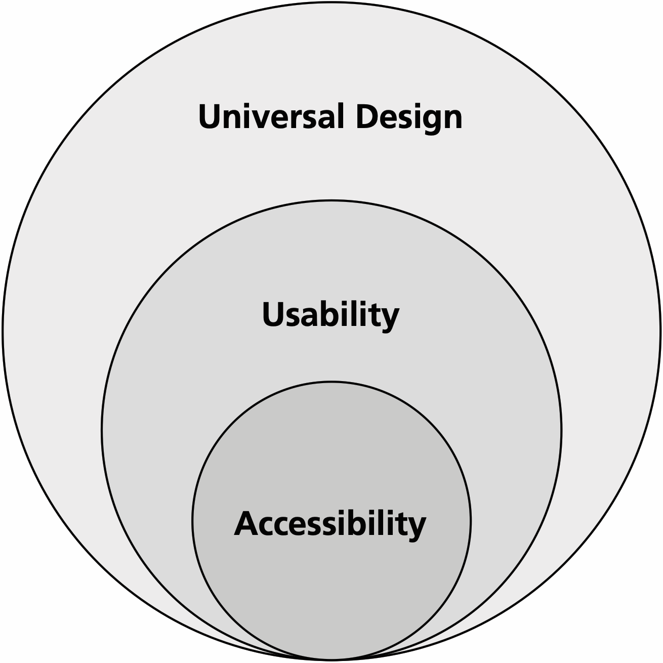
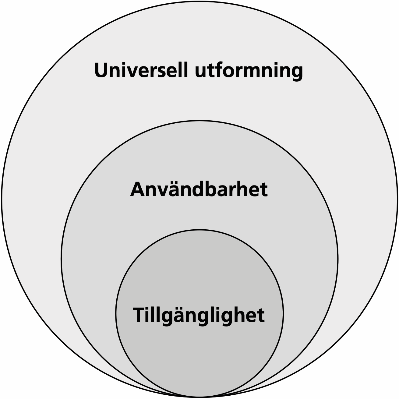
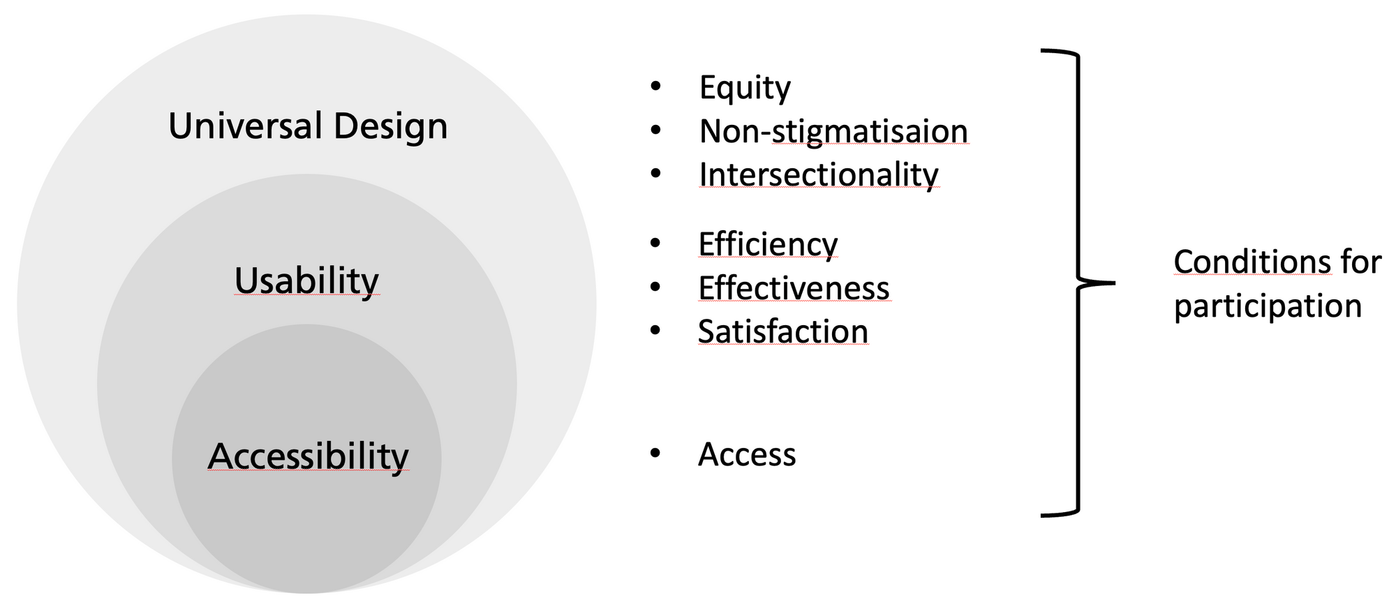
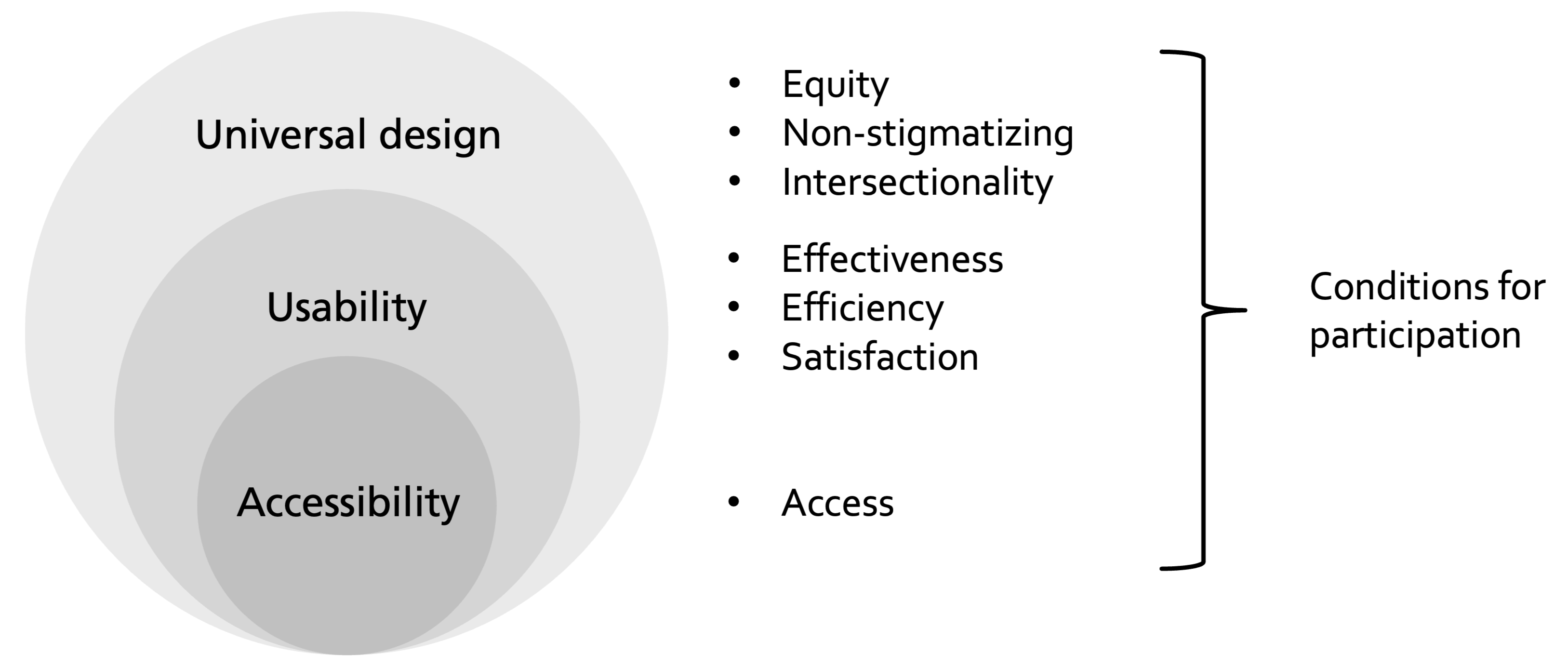
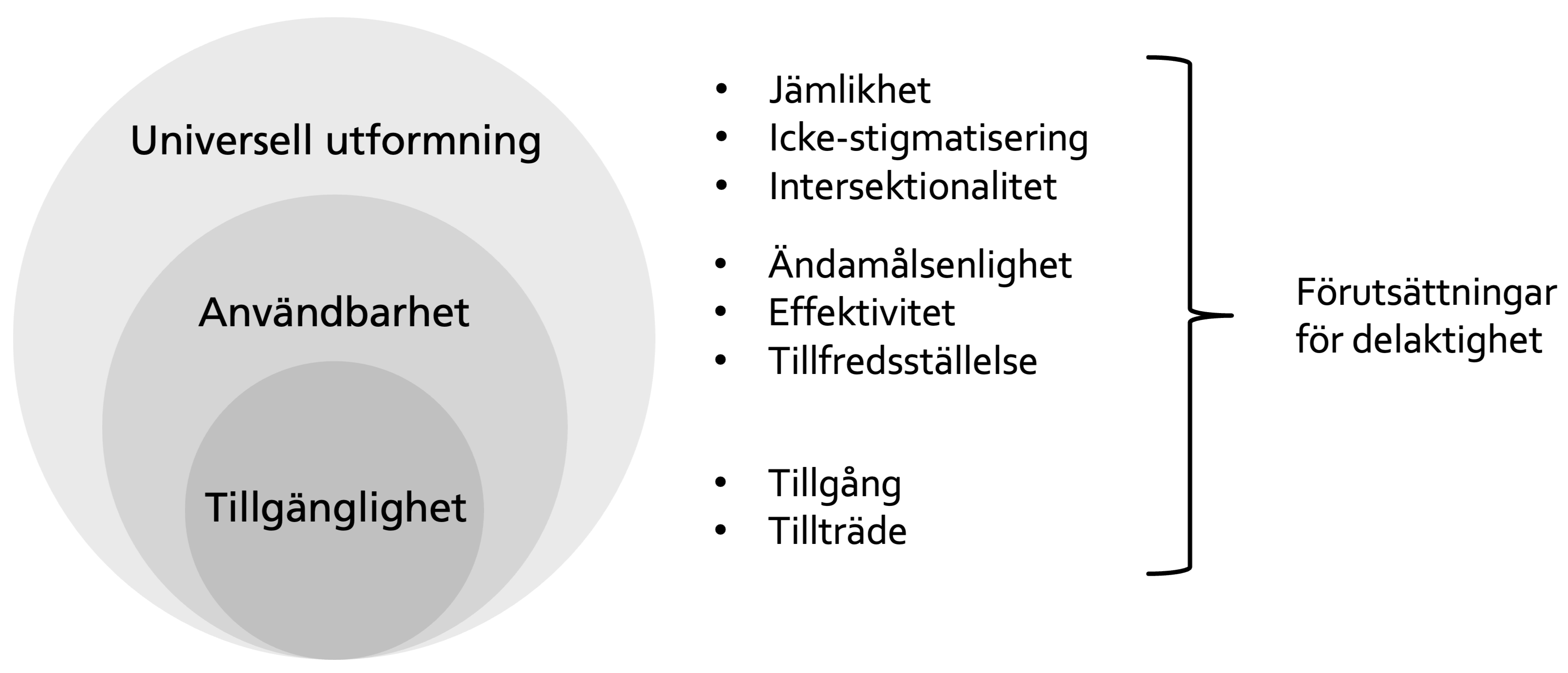
Accessibility, Usability, and Universal Design
The terms Accessibility, Usability and Universal Design all play essential roles in what a person can do and contribute to. In the book "Participation", my colleagues and I elaborate on how the terms are conceptualised and how they relate to each other.
In my teaching, I use the model to describe how the three concepts provide different foci that all are essential as conditions for what a person can do and contribute to, i.e., for participation.
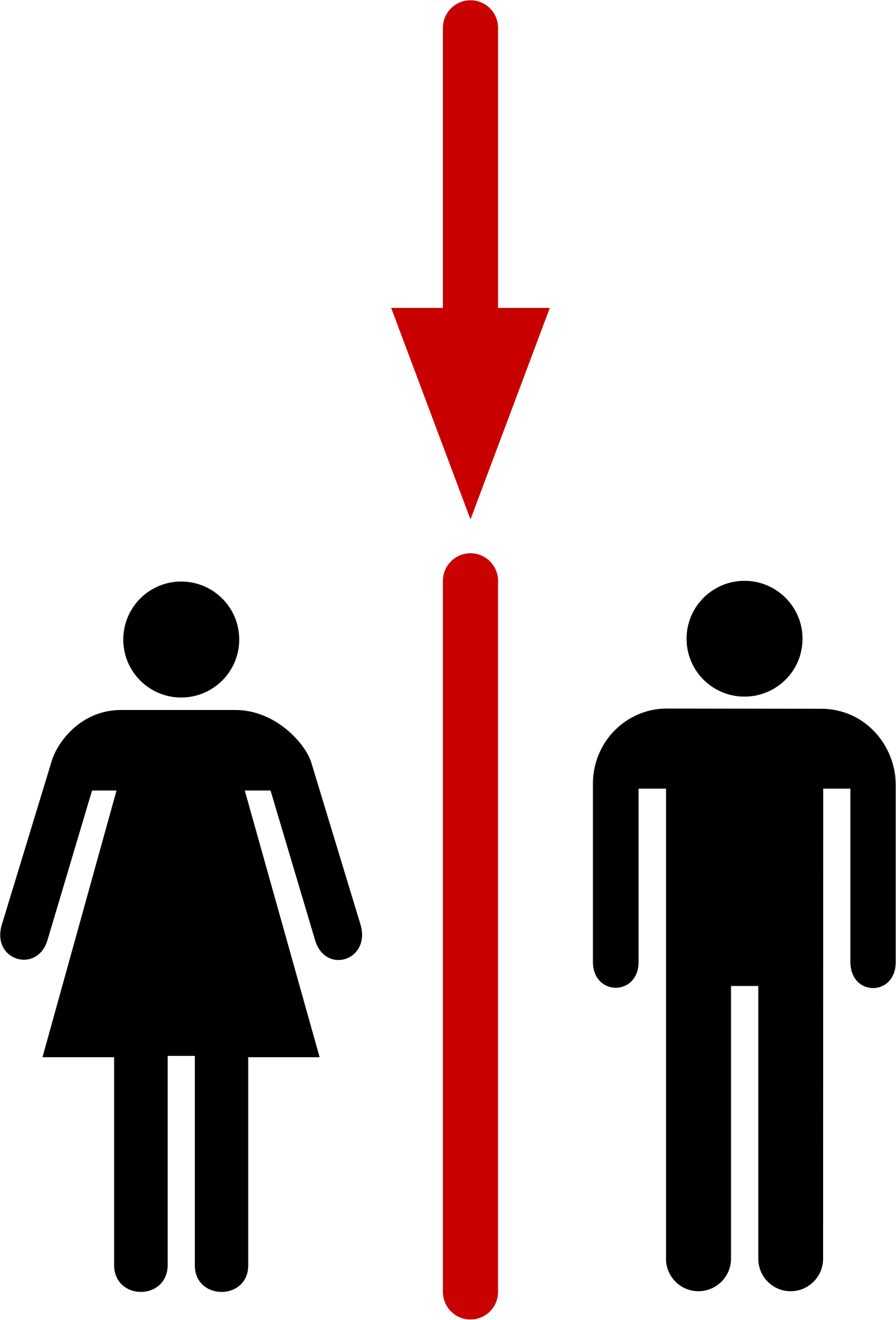
What do categorisations create?
One of our main research themes during the last years is "categorisation". In our research, we explore what categorisations create and what characterise categorisations that do not lead to inequality and stigma. In the pictogram below, I highlighted the separation into "woman" and "man" on toilet doors.