

Hi there! 👋
I love toilet signs. They say a lot about our society and how people think.
We even did a study about different strategies illustrators and designers use to realise inclusive ambitions through signs on toilet doors [1].
Three Ways To Depict Diversity
In the study, we analysed about a hundred photos of toilet doors collected as part of our research* on categorisation, and identified three strategies:
1. Additive – Inclusion by Adding
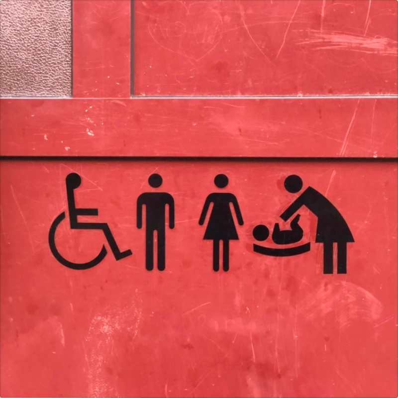
Inclusive signage is achieved by adding pictograms of different persons (see Figure 1). The door has four pictograms depicting a person in a wheelchair, a man, a woman, and a mother changing diapers.
The strategy is additive, where inclusion is achieved by adding more and more pictograms to the door.
2. Combinatory – Inclusion by Combining
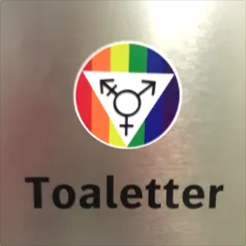
Inclusive signage is accomplished by composite pictograms (see Figure 2). The sign says “Toilets” and carries an all-gender pictogram. The sign deliberately moves beyond pinpointing separate genders, but it still categorises gender.
The strategy is combinatory, where inclusion is achieved by creating a composite sign combining elements usually found as separate pictograms, e.g., “man”, “woman”, “transgender”.
3. Nonclusive – Nonclusion by Categorising Context and Function
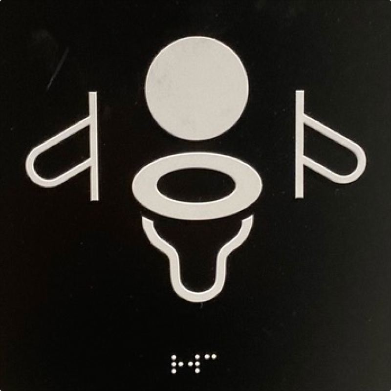
Nonclusive signage is achieved by categorising and depicting something other than bodies, roles and persons. For example, a function can be depicted instead of a person (see Figure 3). In this example, the sign depicts a water closet with handrails.
The strategy is nonclusive [2], showing a shift in categorisation and design practice. Rather than identifying who should use the facility, the sign describes the context and function. What kind of room is it? If it is a toilet, what’s the layout of the room and its functions? By refraining from categorising people, bodies and roles, the focus shifts from the person to the environment and situation instead [3].
These three design approaches represent different ways of thinking about human diversity. While additive and combinatory designs often come from good intentions, they still work within a framework of categorisation that may unintentionally reinforce exclusion.
Towards Nonclusive Design?
The sign to the right is part of our research, where we are exploring a conceptual shift towards “Nonclusive Design”:
“Nonclusive design means design that resists categorisations of bodies/roles and that does not come with predefined or presupposed limits in terms of who it is meant for.” [2]
A recurring pattern in our research is that of "norm and deviation", which creates a division into "us" and "them". Through nonclusion and nonclusive design, we are exploring the consequences of starting from human variation instead of human segmentation and designing based on variation rather than categories of people.
This isn't just another approach to inclusion – it's a critical discussion of the impulse to categorise bodies, persons and roles that creates exclusion in the first place. When a sign or environment places someone on the inside, it simultaneously places someone on the outside.
Counter-arguments
Changing categorisations isn't innocent. Signage practices involve both learning and trust. For example, depicting facilities rather than people assumes that users can interpret functional symbols and that legibility and wayfinding aren't compromised across languages and cultures.
Nonclusion remains more of a question than an answer. Different contexts may call for different strategies, and continued exploration of the concept would benefit from more nuanced discussion of when and where this approach works best.
How to get started
We have found it really helpful to ask questions about categorisations. It was this critical approach that led us to start exploring nonclusion in the first place.
Here are some questions you can try today:
- Think about your work: What underlying categorisations does it rely on?
- Before adding the next pictogram to a sign, ask: Am I categorising a person, role or body? If so, can I describe something in the environment or situation instead?
- And a really hard but important one: will the design decision that I/we are about to make create experiences of "us" and "them"?
I wonder:
- Does the shift in signage from "who is meant to use this" to "what's in here/available in this situation" make sense to you?
- When and where do you think this approach works best?
I'd love to hear what you learn! Let's keep this discussion going 😊
* This piece builds on material from our research into nonclusive design and categorisation in “The Syntax of Equality” project. Some images were submitted as part of citizen science studies on inclusion and exclusion, and some we took ourselves as part of observational studies. The article is an expanded version of a post from earlier this year.
Want to use the photos or illustrations in a publication? Please go ahead. Or in a presentation or video? Please do, and tell me about how you use them and what you learn! I appreciate attribution in some form, i.e., that you tell where you got the material from ("Per-Olof Hedvall"), but it is not mandatory. 👍
References:
- Hedvall, P. O., Johansson, S., & Ericsson, S. (2022). Moving Beyond Human Bodies on Display—Signs of a Shift in Categorisation. Drawing, Accessibility, Inclusion (DAI2022).
- Hedvall, P.-O., Price, M., Keller, J., & Ericsson, S. (2022). Towards 3rd Generation Universal Design: Exploring Nonclusive Design. Transforming Our World through Universal Design for Human Development, 85–92. https://doi.org/10.3233/SHTI220824.
- Ericsson, S., & Hedvall, P. O. (2024). Situation, Non-categorisation, and Variation—Conveying Nonclusion Through Text and Image. In Difference – Sketching, Visualising and challenging Universal Design in Sweden (Vol. 19, pp. 31–50). Design for All Institute of India. http://designforall.in/?mdocs-file=2472.


